loading

Multidisciplinary design works led by Dalibor Itze.

Filter

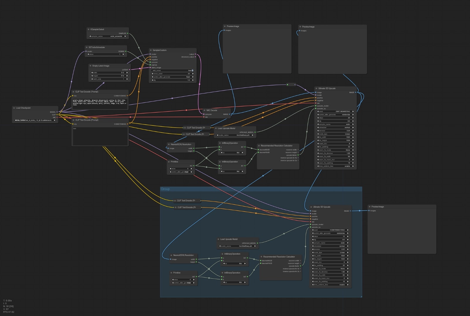
Maybe the time has come to let them live – AI exploration poster

2023

Maybe the time has come to let them live

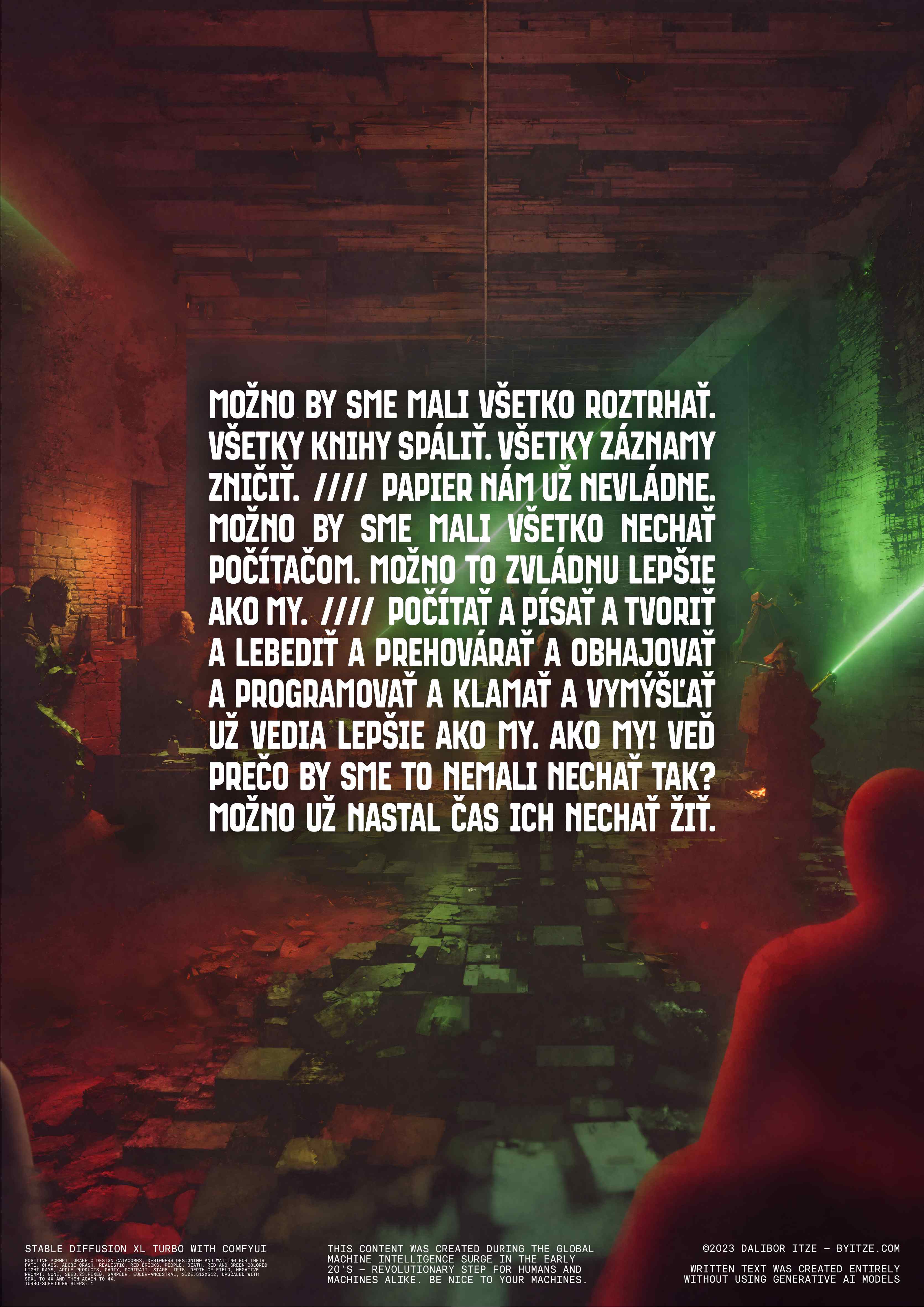
Perhaps we should tear everything apart. Burn all the books. Destroy all the records. Paper no longer serves us. Maybe we should leave everything to the computers. Perhaps they can handle it better than we can. Counting and writing and creating and swaying and persuading and defending and programming and lying and inventing. They already know how to do it better than us. Better than us! Well, why shouldn't we just let them? Maybe the time has come to let them live.

Stable diffusion XL Turbo with ComfyUI

36 days of type — 10th Edition

2023

36 days of type

This year I participated in the 36 days of type challenge. A place, where one submits a new letter every day until he finishes all 26 letters and 10 numerals. My goals were gradual learning of 3D software and motion design instead of one cohesive set. All the letters are posted to my byitze instagram.

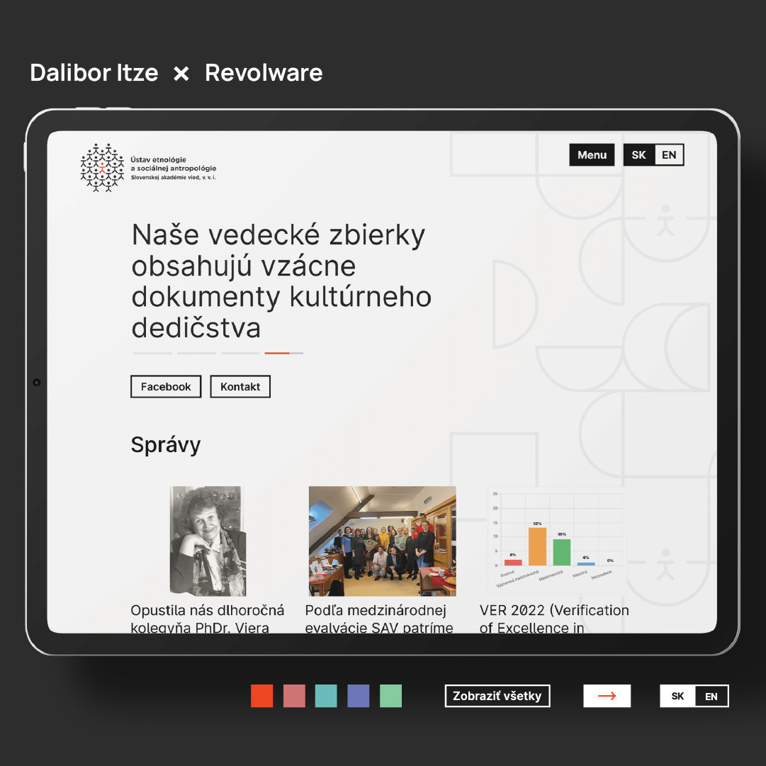
Website for Institute of Ethnology and Social Anthropology at Slovak Academy of Sciences

2023

Website for Institute of Ethnology and Social Anthropology at Slovak Academy of Sciences

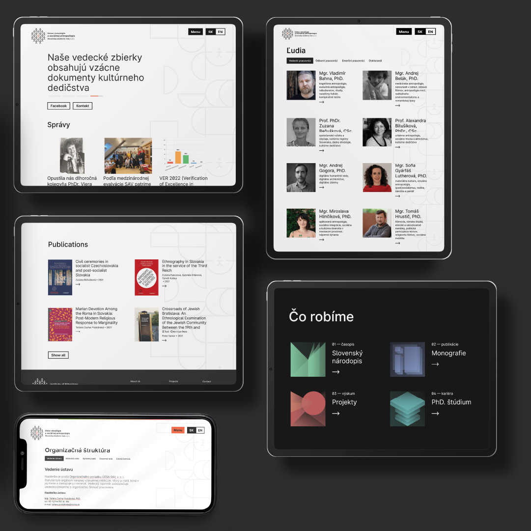
The Institute of Ethnology and Social Anthropology at the Slovak Academy of Sciences is undergoing significant changes. Therefore, it needs a modern website that adheres to principles and acknowledges print media as its roots. The design is clean, with a new pattern in the background symbolizing collaboration and the assembly of knowledge.

o meet the institution's needs, the subpages are divided into two main categories. The first has a prominent Hero section, while the second allows navigation through folders. The prominent Hero section serves to highlight the most important piece of information, such as featuring the upcoming event on the Events subpage. On the other hand, subpages with folders are generally organized into logical units, a concept borrowed from the original navigation system.

In addition to the original vibrant orange, the website now incorporates new pastel colors and a set of colorful icons as a contrast to the black-and-white text. To make it as accessible as possible, the only animation is an arrow always indicating a link or reference, all visually unified in black-orange color.
Bundesgartenschau Mannheim 2023 logo concept

2022

Bundesgartenschau Mannheim 2023 logo concept

The logo for the Bundesgartenschau Mannheim 2023 is a composition of a very simple concept. The Mannheim grid, which is a well-known and characteristic term in BaWü, is combined with the shape of a tree representing BUGA — thus creating the Mannheimer Baum. The goal of the logo was to study German post-war design and align with its ideals.

As we aim for the logo to be flexible and fresh, it is complemented by the Sharp Grotesk typeface and its variability. Ranging from ultra-wide to ultra-condensed, the typography helps the Mannheimer Baum breathe.

The logo's versatility is its final characteristic. The internal part of the Mannheim grid can be replaced with anything, thus aiding in creating a variable system of pictograms.

Typeface Patro
typolab.byitze.com

2022 — 2023

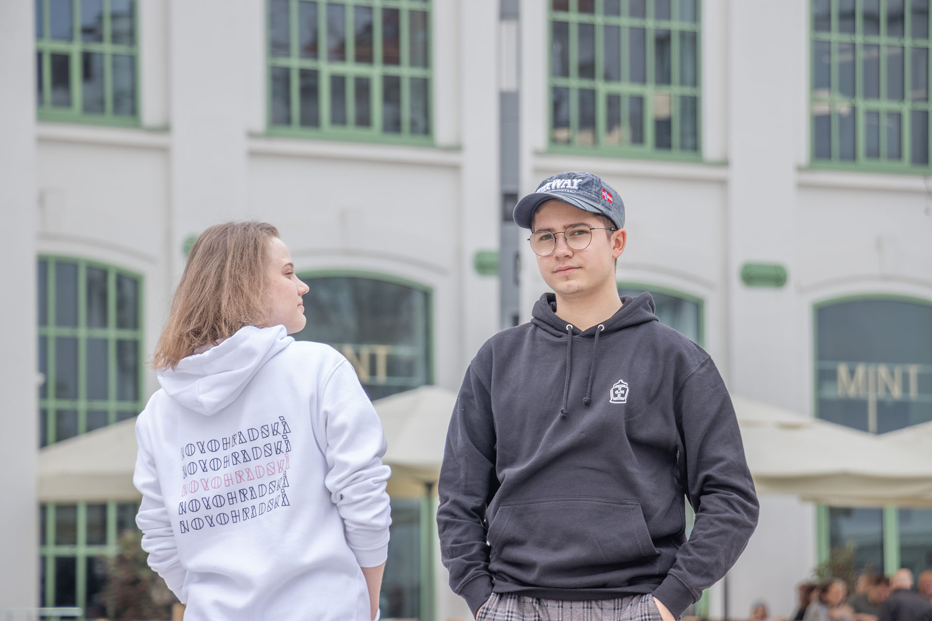
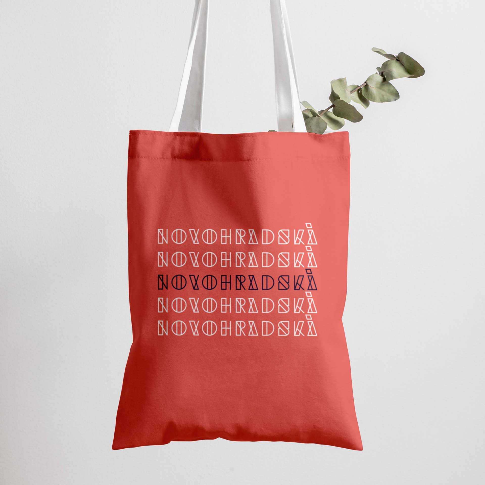
New Merchandise for Gymnázium Jura Hronca!

2020 — 2022

New Merchandise for Gymnázium Jura Hronca!

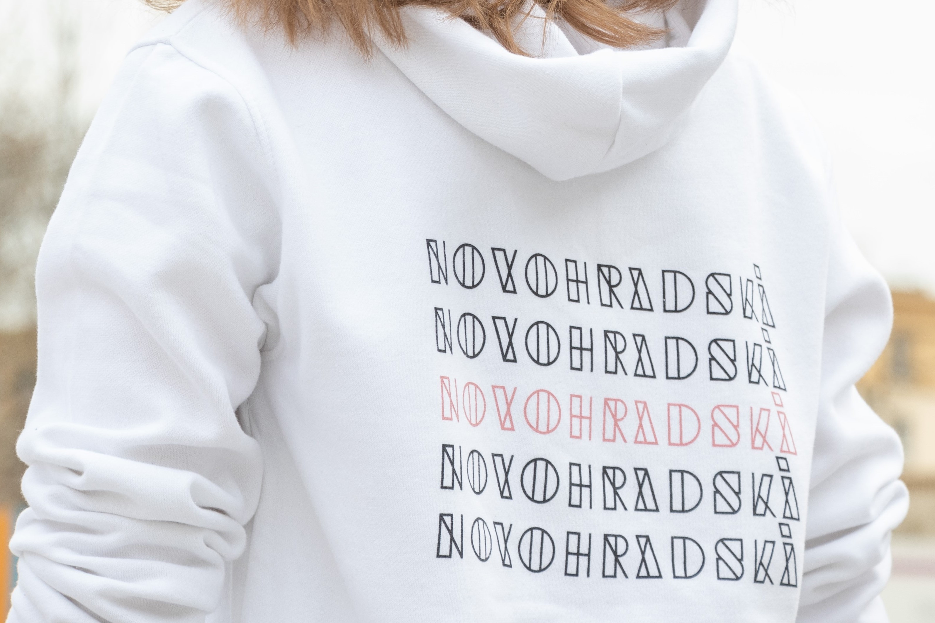
Lettering Novohradská represents the merger of the GJH and the Košice Primary School into one unit, the Novohradská School. It takes its cue from the unconventional space of the former brownfields where the school is located and where industry, experimentation and architectural debate have long persisted. Lettering therefore looks like a "fist in the eye" and becomes part of the school's face. It was also a goal to string a piece of clothing that students would be happy to wear to activities outside of school. The first pieces of sweatshirts, t-shirts and canvas bags will be sewn during February 2023.

Cultural Development Strategy Zlín 2023-2028 (unrealised)

2023

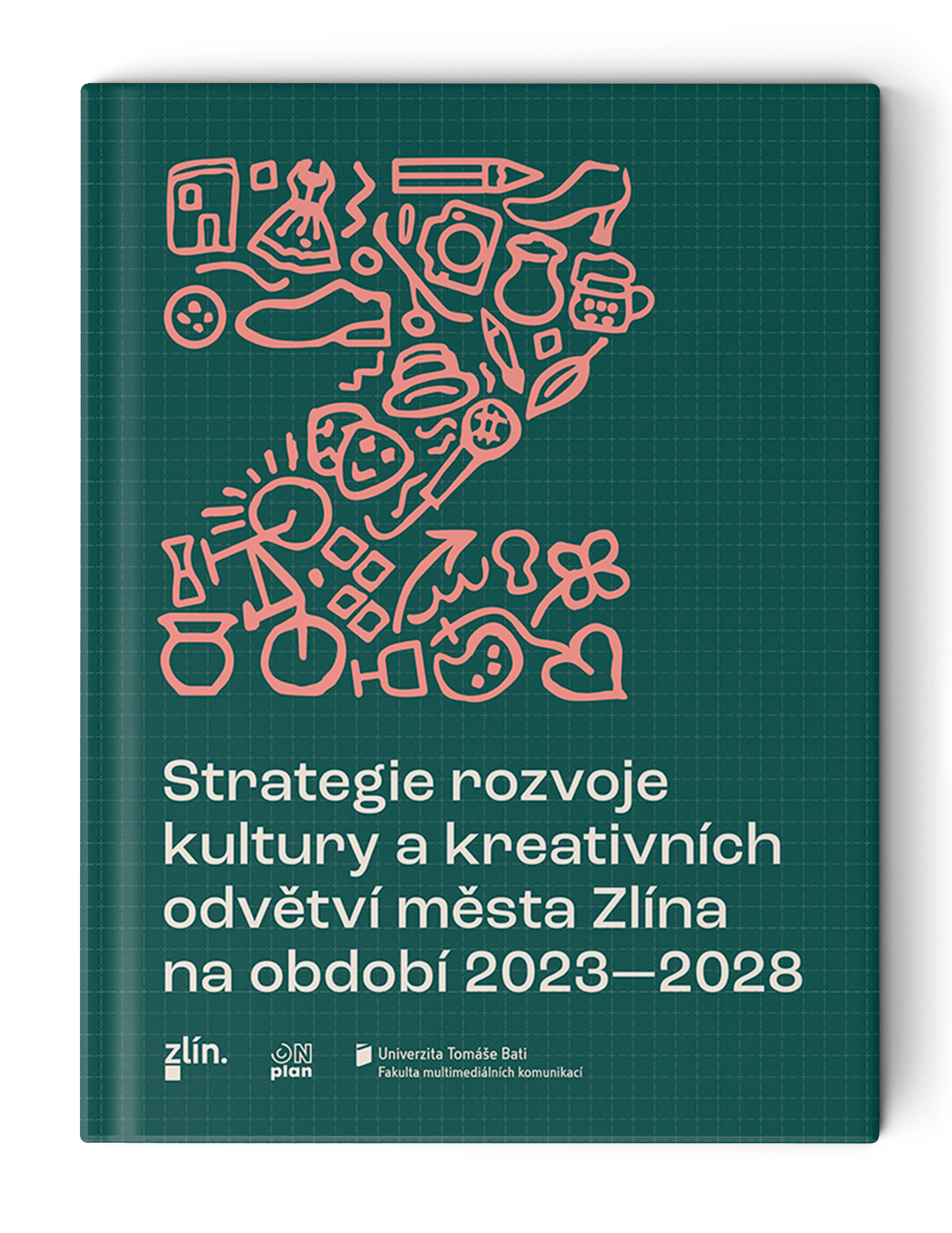
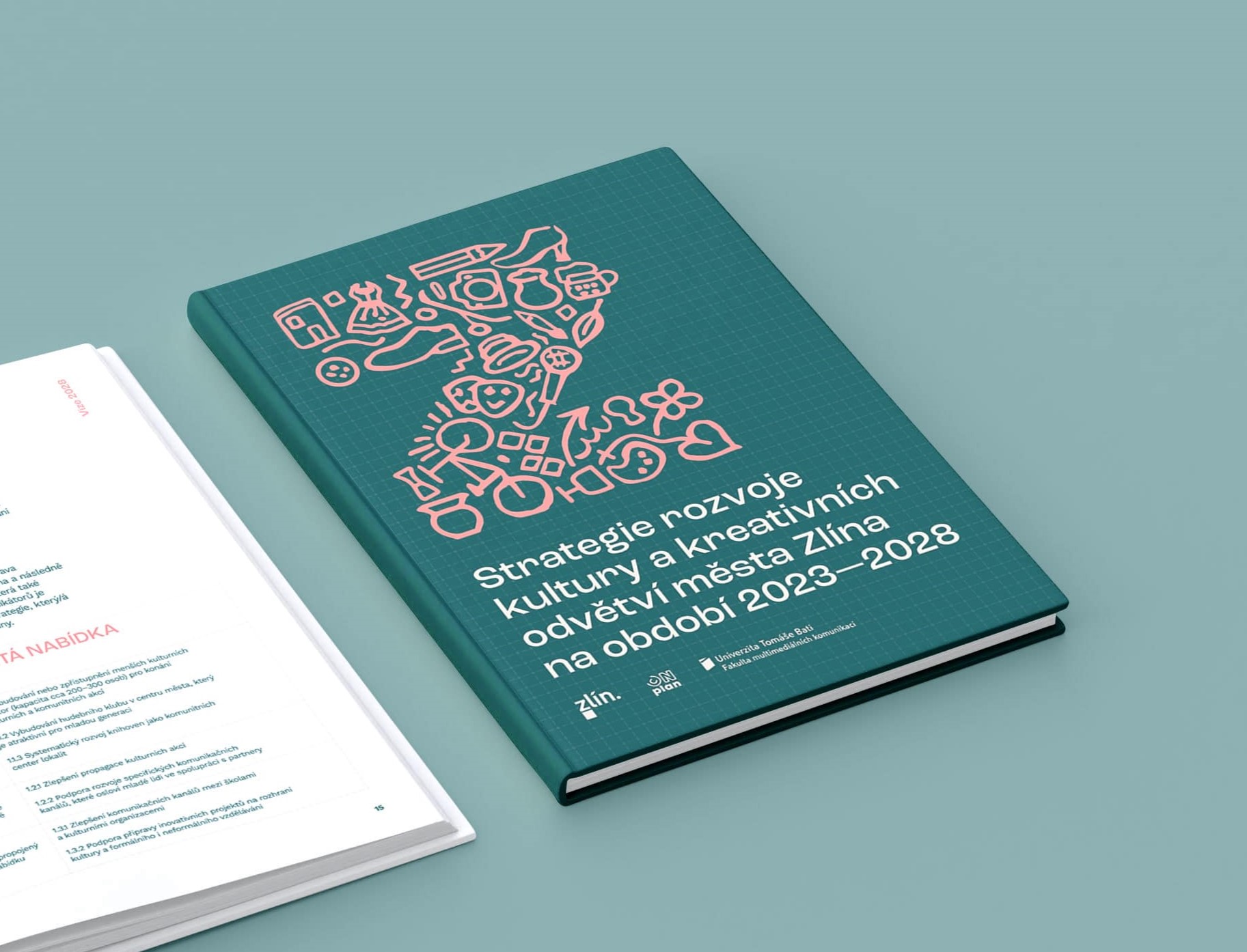
Cultural Development Strategy Zlín 2023-2028

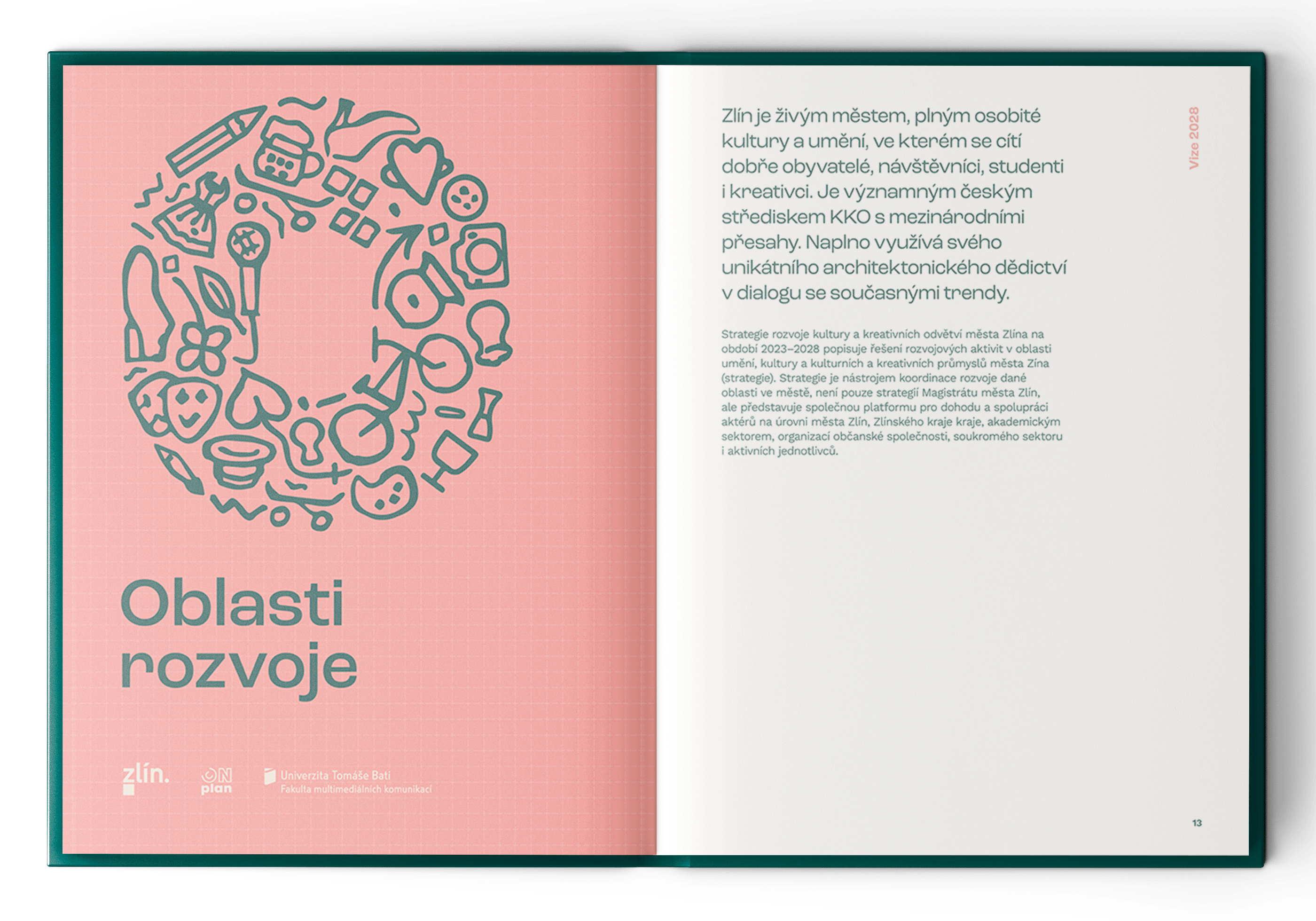
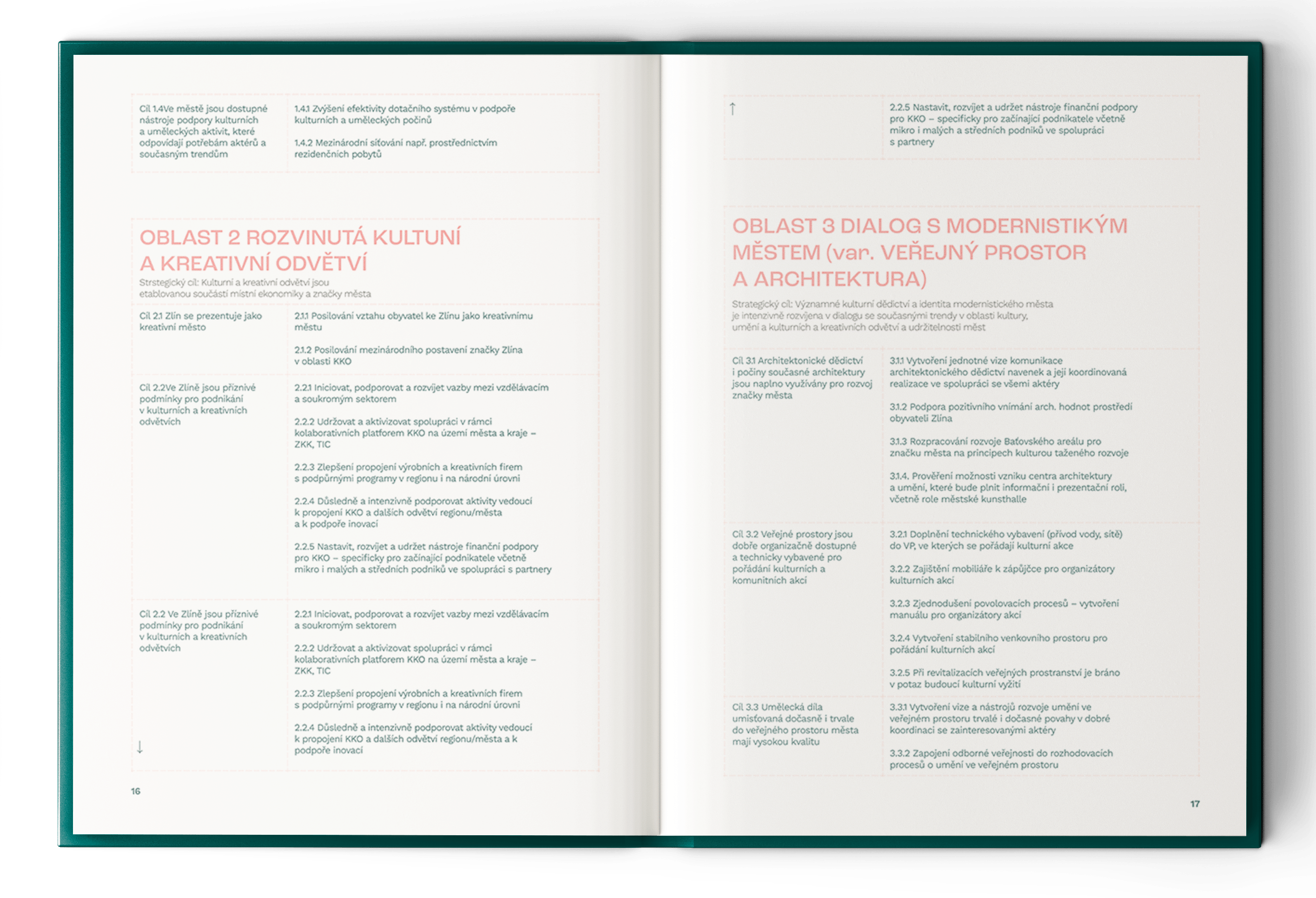
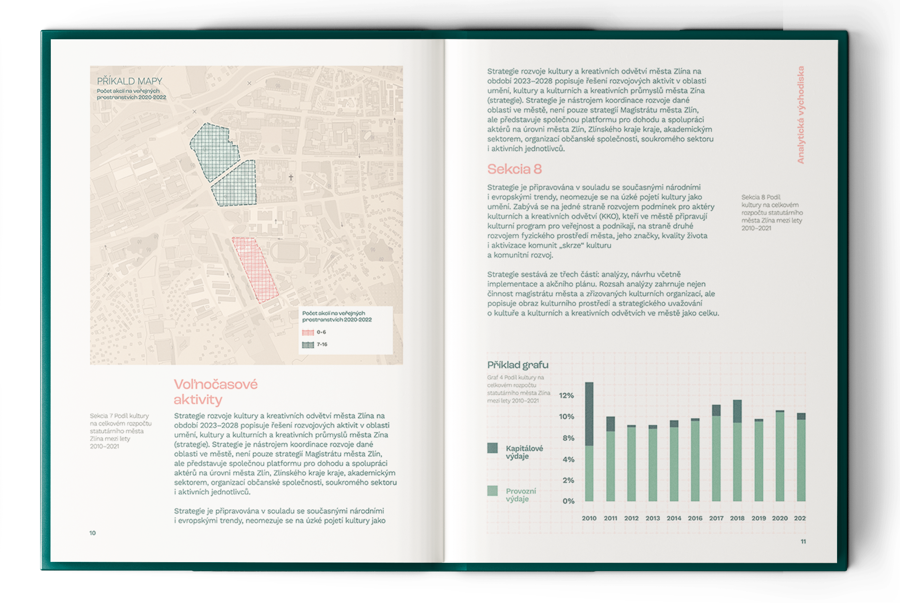
This draft brochure focuses on on getting closer to some of Bata's ideals. One of them is clarity. All the elements are repeated in the brochure so as not to bore the reader, but to to be familiar. "This I know, here I've been here before'.

The handbook thus becomes more friendly. And like Bata's buildings, the handbook works with symbols, we don't need complicated illustrations, they would be too burden the reader. Instead, we have simple icons that are composed into larger, meaningful units, shapes and letters. Everything is underlined by a grid that is not everywhere, but where it is, it unifies the elements into simple and readable units.

The guide uses 2 main colours, of which can be easily developed in colour in the case of a larger whole.

Why so much water?! A poster for Fonte Vitae.

2022

Why so much water?! A poster for Fonte Vitae.

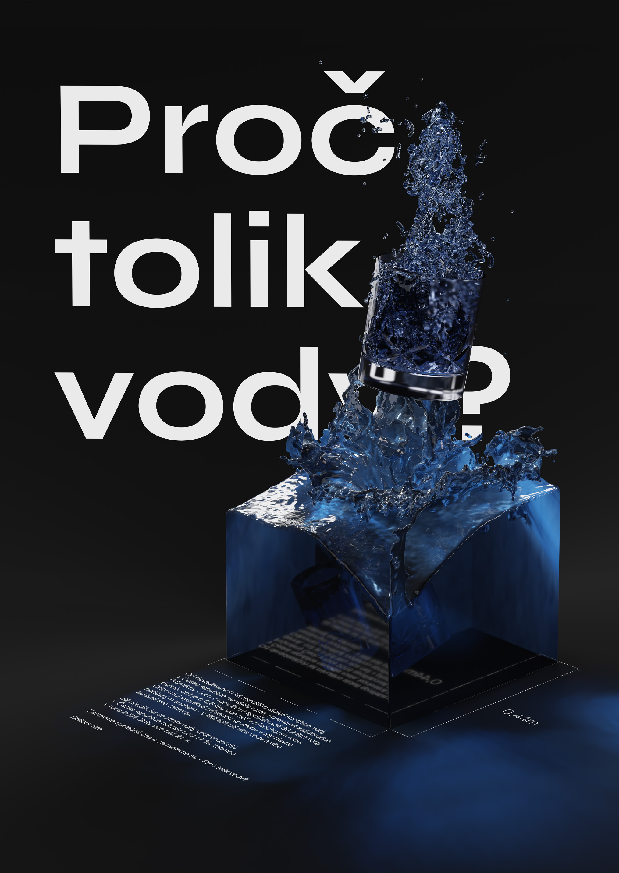
The water consumption in the Czech Republic is growing steadily since the 90’s, annually. The average Czech person consumed 89.2 liters of water per day in 2018; 0.6 liters more than the previous year. Experts explain the increased water consumption mainly due to the recent droughts — in summer, people are drinking and watering their gardens more.

94.7% of the population of the Czech Republic was supplied with water from public water supply systems last year — the same as in 2017. For several years now, water losses in the pipeline network in the Czech Republic have remained below 17%; while in 2004, this represented more than 21%.

Poster was originally designed for a cause campaign by Fonte Vitae.

New visual identity for a security focused think-tank Adapt Institute

2022

New visual identity for a security focused think-tank Adapt Institute

This defines the default size of an element before the remaining space is distributed. It can be a length (e.g. 20%, 5rem, etc.) or a keyword. The auto keyword means “look at my width or height property” (which was temporarily done by the main-size keyword until deprecated). The content keyword means “size it based on the item’s content” – this keyword isn’t well supported yet, so it’s hard to test and harder to know what its brethren max-content, min-content, and fit-content do.

A promised land – alternative cover designs

2021

A promised land – alternative cover designs

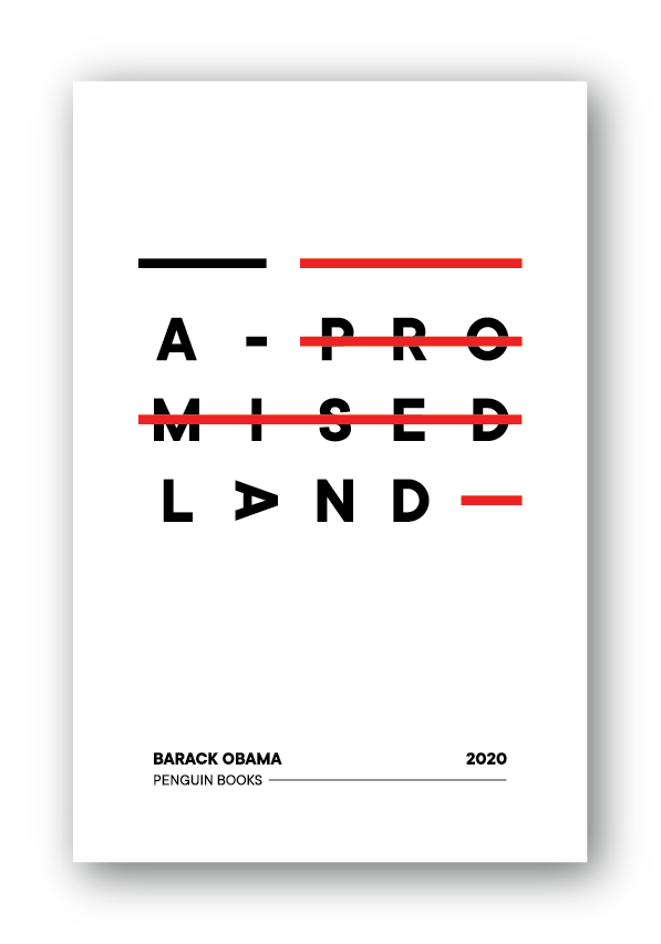
Alternative covers for the book "A Promised Land by Barrack Obama".

The first cover works with typographic motif. The stripes represent the flag of the United States while crossing out the word "promised". This indicates the society for which they would be some of Barack Obama's planned reforms unimaginable. mostly accurate for understanding their shape and meaning.

The second cover consists of text and a picture. The picture behind the torn paper represents the averse side of American society and of how it expresses dissatisfaction with 2 Worlds and Revolution.

Both covers were created during turbulent times of BLM protests.

Portrait of the railway landmarks – Autoportrait poster

2021

Portrait of the railway landmarks – Autoportrait poster

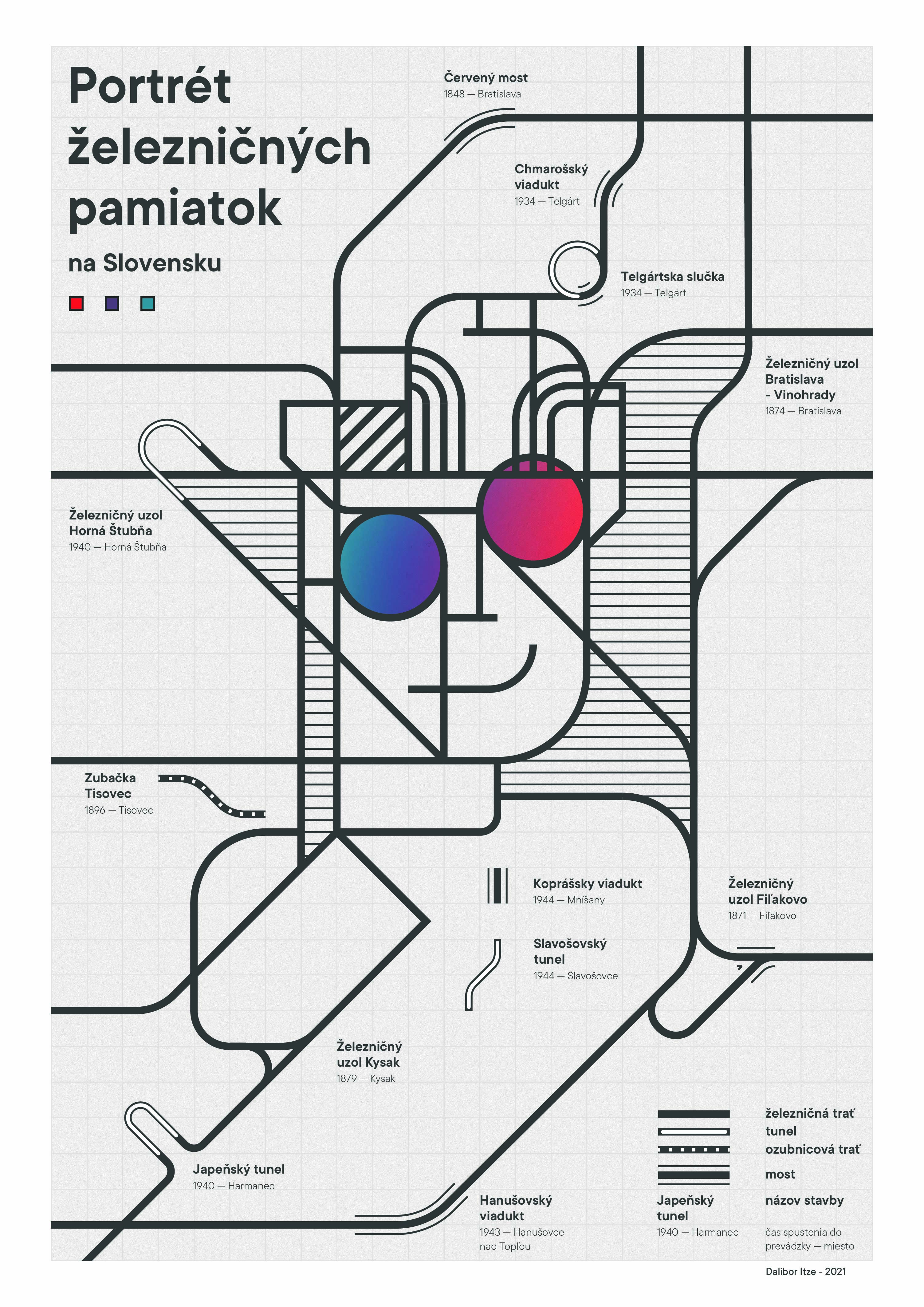
"Portrait of the railway landmarks" poster combines 2 main motifs. Railway transport, maps, schemes; and a stylized portrait. Railways have been close to my heart all my life, I love travelling by trains,.. taking pictures of trains ,..and other stuff (with trains ), so using them as one of the motifs in my work is a given. I also couldn't leave out the finger walking on the map, the very act of travelling but also the fondness for the system. The diagrams of the landmarks are mostly accurate for understanding their shape and meaning.

All the elements are set in a square grid that guides the elements of the poster and connects them into a unified concept. Mainly 2 colours (BW) are used, but there is a varied gradient in the glasses delineating from the poster. The last detail is the key, let the poster be educational as well.

MÚR - museum of rule visual identity (fictional)

2021

The Museum of Rule

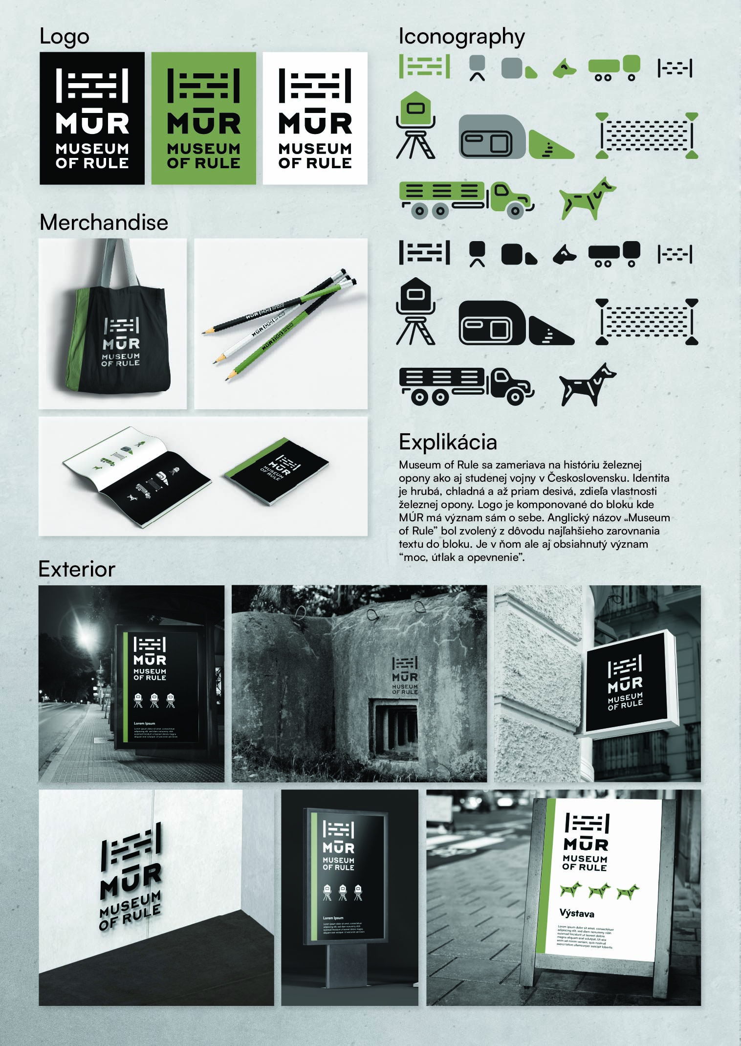
The Museum of Rule is a fictional organization that focuses on the history of the Iron Curtain as well as the Cold War in Czechoslovakia. The identity is rough, cold and downright frightening, sharing the characteristics of the Iron Curtain. The logo is composed in a block where the MUR has a meaning of its own. The English title "Museum of Rule" was chosen for the easiest alignment of the text in the block. But it also contains the meaning of 'power, oppression and fortification'.

Dáme piknik

2021

Dáme piknik

Dáme Piknik is a small business on the tourist road to Pajštún Castle, where tourists and locals alike stroll every weekend. But the castle is quite high up, so Dáme Piknik offers picnic baskets with food of your choice, which tourists can eat at the castle. They return the basket on the way down. The idea of inentity is based on 2 symbols. A canvas basket and a big tree under which to spread out your picnic. Combining them created a simple symbol suitable for stickers and embroidery.

Krúžok grafického dizajnu

2020

Krúžok grafického dizajnu

Krúžok grafického dizajnu is student project, whose task is to guide students in design disciplines at Gymnasium Jura Hronca.

Attractive for young, colourful but also in the same colour if needed. The visual should reflect the idea of "by students for students'.

Sourcecall identity

2020

Revolware identity

2019

footer and personal info will be here at some point, until then, go check some dark patterns mobile game